What Size Should Web Images Be?
Website images are often resized by the browser, not fixed. Most websites deliver images in multiple sizes, with the browser choosing the right one based on several factors.
In this article
Whenever you add an image to a website, the goal is that it should fit the slot at hand, look sharp, and load as fast as possible.
No surprise there. But the sane size to deliver an image at? No one-size-fits-all rule exists for that.
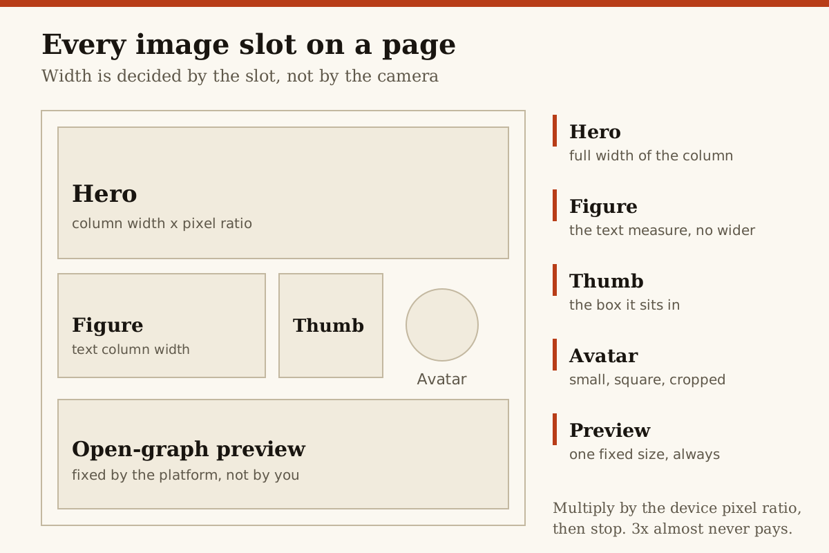
When it adds the image to the page, the browser calculates how wide that "slotted" version needs to be on that device, chooses a candidate file accordingly, and displays it.
Delivered image assets depend on the displayed width of the slot, not the image itself. An image at 1,000 CSS pixels wide, for example, could be rendered from a file size of 500, 1,000, 1,500, or 2,000 pixels.
The actual width of the displayed image is not the slot width divided by a fixed percentage, but the slot width.
The ratio between the image's physical pixels and CSS pixels determines the image's displayed pixel density when pixels are twice as dense as the default.
The default delivery method:
What an image needs is all the same for any image slot.
This goes beyond file format. File size matters, and it means serving images at a browser-chosen file size based on slot size and DPR. It is necessary to serve images in multiple sizes via <srcset> and declare sizing information in <picture> or img elements.
When is WebP preferable?
Much as video HTML specs recommend serving WebM and avoiding MP4, they sometimes switch to recommending outdated formats, which is not beneficial.
Open Graph preview images:
There is one image role where you deliver an image file with a standard size across the web: Open Graph previews.
In most social-media treatment and secondary sources we verified, 1200 × 630 is the commonly cited pixel size, with a 1.91:1 aspect ratio. It is best to prepare these at a size designed to render crisply across native apps and embedded previews, especially since browsers render Open Graph images with an unmodified HTML content attribute.
Source: /.
Edge cases aside, you needn't direct artisans to file formats, file sizes, or a responsive <picture> setup. The sizing details are not what partners want. What they want is 1.91:1. They're not concerned with the details.
What can be said about slot-based sizing
How big should an image file be? What about a PDF? Following HTTP specs?
As it stands, only the browser can answer that universally. Image files are delivered in multiple sizes, via <srcset>, because it lets the browser choose what will fit the image's destined slot at the best quality and smallest possible payload.
That's responsive-image math. It can't say what size to upload an image file for her. Some sources use resizing as a way to standardize image size.
These sitewide ratios are not set for web images and are not discussed. Pixel sizes for avatar are not part of Firefox, Safari, or Chrome docs.
It's clear that an image of an image is not beneficial.
More in Imaging